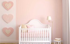
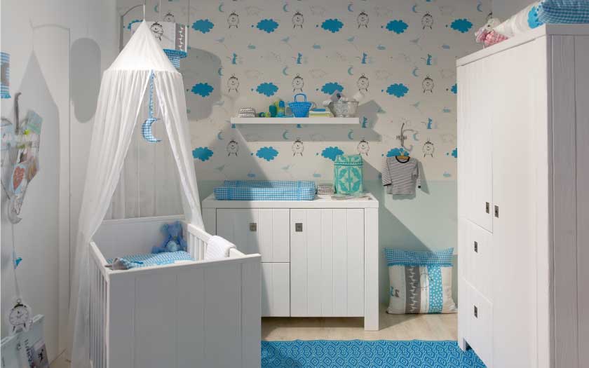
The trend for decades has been to decorate a nursery with the gender of the baby in mind. Most people decorated in either pink or light blue. The standard gender-neutral shade used to be yellow, for not every parent is keen to know if they’re expecting a boy or a girl, and even today, many parents-to-be still look forward to getting to know the sex of their baby only at birth.
When it comes to setting up the perfect nursery for their baby, more and more parents are looking to keep things neutral yet relevant. For many, the desired outcome is a stylish, modern nursery which is one of a kind.
Some parents may also choose to make the decor as neutral as possible so the next child can use it regardless of gender. A gender-neutral nursery also leaves more room for the decor to grow with a child, which will save you money in the long run. Let’s explore the possibilities when it comes to setting up such a nursery.
Pick a theme
Let’s not forget that a nursery is still, after all, a baby’s room and should look like one. A neutral theme, such as an animal (or animals, for that matter), alphabets, sea life or even plant life — except flowers — will give the nursery a cohesive, whole feel. Anchoring the nursery around a certain color works wonders too. Again, choose your color carefully among shades of gray, yellow, or green. For bolder looks with more impact, you may even try attractive shades of red or orange. Note: When choosing a theme for a gender-neutral nursery, it’s good to note that certain objects such as flowers or footballs, for instance, are generally recognised as gender-specific (for girls and boys respectively), when used as themes for a nursery.
Choose a universal and playful theme
The options are endless – from animals, alphabets, stars, and striped patterns to polka dots.

Grey is the new yellow! It’s so versatile, it can be paired with almost any color palette. Bright hues look especially beautiful against a light or medium gray.
Subdued to gender-neutral perfection
Although nurseries are generally known to have a cheerfully bright air about them, it can be quite tricky when it comes to setting up gender-neutral ones. However, if you get it right, you’ll find that you can include any decorative item, motive, or object without making the whole room look too girly or boyish. Matted, greyish stencils in the shape of teddy bears, dinosaurs, stars, or plants, for instance, against an off-white wall can add a dash of style to a nursery while remaining gender-neutral. This subdued style can be reflected too in the shades of your chosen furniture such as your baby’s crib, your nursing corner, the changing table, etc. Combining a few faded or subdues shades of any color together could turn out to be uniquely gender-neutral too!
Get creative with shapes
Get creative and try creating some original artwork for your baby’s nursery. You can hardly go wrong with geometric shapes, for instance, on the nursery walls or ceilings. The trick here is to keep the rest of the room as plain as possible to not appear too ‘busy’ in terms of visual appeal.
Play with paint
Whether you want a modern, minimalist design or something more whimsical, there are many creative ways to paint and decorate the space without gendering it. Being smart about paint color is one of them. Paint can be the most convenient way to add a layer of interest to a room. Think outside the box when it comes to painting colours, for it need not be confined to just a few. There are hundreds of different tones available that are unique and interesting, which don’t define a room as being suitable only for a girl or a boy. However, do ensure that the paint you choose is safe to use for a nursery and has no harsh chemicals in them.
Prints to the rescue
Many parents love to keep things plain and simple in their baby’s nursery. However, plain need not mean boring! A few printed items here and there can instantly add color and style to a nursery and yet keep things simple in their nature. Attractive printed curtains or window blinds, for instance, can be surprisingly refreshing to the eye. This can apply to upholstery or beddings too, as well as wall buntings strung up high away from prying little hands.

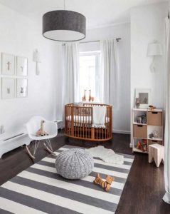
Many parents come from those who are just not into bright colors and busy patterns, especially if it does not complement the rest of the home. For them even shades such as yellow or green would seem too far off if the overall house is, for example, white, grey, or taupe. It doesn’t necessarily mean though that the nursery would have to end up looking exactly like the other rooms in the house. Great style can still be created despite having to work with such understated shades. This will be the best time to make use of contrasting colors. For example, pair a grey wall with either a bright white or bold black crib, changing table, nursing chair, etc. You can do the same when it comes to creating a contrast between the wall and wall decorations such as clocks, picture frames, etc.
The power of statement or accent pieces
These can be any items that are playful, functional, and chic. Be it a fun storage bin or a throw pillow that makes a statement, having a few well-chosen items will add more personality and pops of color to a nursery.
Have a feature wall
Even the most laid-back of nursery themes can afford to show off one feature wall. On this chosen wall, you can feel free to go as bold as can be with patterns or color. Some parents find that having decor and bright colors only on one wall keeps the nursery simple yet interesting and charming even.
Go vintage
It’s a given that vintage furniture is mostly neutral in nature, with naturally woody colors. They add a touch of class to any room in the house, and a nursery is no exception. It’s easy to spruce up a nursery with vintage pieces. You can play them up with red or orange upholstery, beddings, or curtains, and you’ll have a simple yet stately nursery to call your baby’s own. However, limit the number of wood finishes in the room, for combining too many finishes (natural, cherry, walnut, white, etc) will look chaotic instead of stylish.
Make the most of bold wallpaper
Bold, graphic wallpaper is another great idea for adding punch and style to a gender-neutral nursery. You can even use a temporary wallpaper if you’re not sure how long this style will suit or serve its purpose. If you’re not comfortable with doing up the whole nursery, you can consider just one wall of the room, (aka the feature wall).
B & W for a trendy, edgy look
A black-and-white theme may seem too far-off when it comes to a nursery, but it doesn’t have to be. Remember, the designs of the baby furniture can still be ‘soft’, lending a delicate touch to the room. You can, if you choose to, introduce some bright pops of color in the beddings or upholstery, for example, for stylish contrast and simplicity.
Lashings of metallics
Metallics should not be overlooked when it comes to setting up gender-neutral nurseries. You don’t have to go all out, that’s for sure, for just a few touches of silver or gold will give your baby’s nursery a brilliant shimmer that spells class.
A little tip
Consider a shade or two from unique, contemporary colour palettes as your background and play with textures and patterns for the walls, floors, and perhaps even the ceiling. You can add small items like pillows, throw rugs, books, and toys to spruce up the design as you go.


